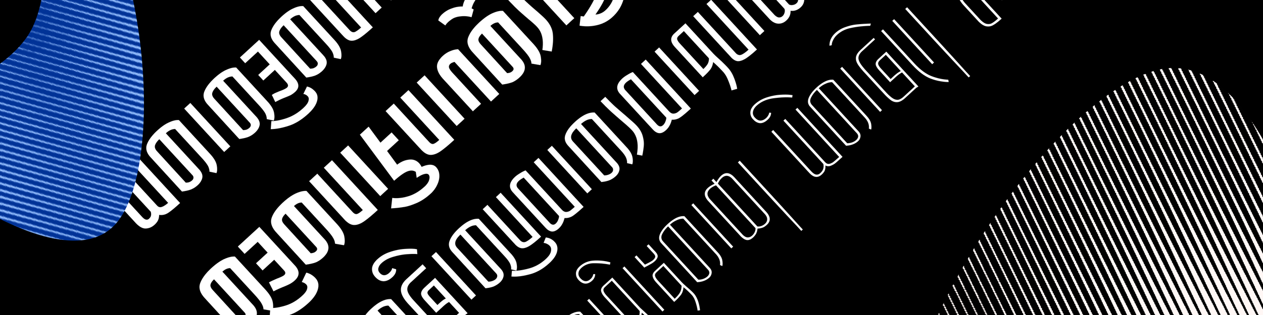
Sans Serif Tibetan Font Exploration
We created a sans-serif typeface based on Betsug calligraphy style for users of Tibetan scripts. We named it KhaWa Sans Beta and made it open source. The font is optimized for digital screen display and aims to enable users to create graphical artifacts in modern and minimal style.


Design discussion
We choose Ume letter instead of Uchen letter as the meta-form for exploring sans serif style on Tibetan scripts.
First of all, we target the modern secular life as the main scenario for our new font family, which suggests that we’re going to design something practical. The Ume letter itself, as a “cursive” style optimized for more efficient handwriting, is a milestone of becoming simpler and more practical as Tibetan scripts continously evolving.Therefor, we choose Ume since our design goal is well resonant with the appearance of Ume letter
Next, the shape of Ume letter is much simpler and similar to Latin letters, so we can apply knowledge of design Latin typeface easier onto our case and reduce the work load in a certain extend.
Last but not least, there are tremendous calligraphy variants of writing Ume letter that highlighting diverse personal expression of calligraphers, so we’d like to get inspired by those traditions when creating new typeface or variant of this font family in future.
All we want to do here is trying to sychronize our design with existing trends.
-
In this design exploration, there are three variables we introduced into this font family from Latin typeface design practices: Weight, Width and Descender Depth.
Weight
Majority of digital Tibetan typefaces available nowadays are trying to represent traditional calligraphy styles, only a couple of font families have the modern concept of font weight genuinely incooperated in the design.
Therefore, we’re exaggeratedly trying to create weight variants in KhaWa Sans Beta, hoping we can probe and reveal design and development challenges as much as possible
The figure below illustrates an example of imperfect design when we developing glyphs that are extremely thin and thick. There are many other cases of imperfection in this beta version. We’re more than happy to sharing our learnings and looking forward to find out solutions together with you.

Width
We applied the way the traditional calligraphers created (Tsuring style) to horizontally condense the letters.

Descender Depth
Vowel marks and descender of consonat letters in many Ume calligraphy styles are written extremely large, which produce rich and vibrate visual satisfaction. However, we want to achieve a vibe of calm, neutral, simple and efficient with our new font design, hence we have chosen Betsug style as our primalry calligraphy reference. It comes with shortest descender depth among all calligraphy styles in Ume scripts.

Meanwhile, we’re aware that a proper descender depth will help the legibility of typeface, so we’ve given deeper descenders in our text fonts comparing to display fonts.